Problem: The current logo for the PGA tour has many interesting elements to them such as the colors of red white and blue and the use of a nice serif type face,
Even though the elements stated are good the bad ones out weight them by a large margin. The use of the word PGA on top of an even bigger word "tour" isn't great, either is the outline of the the word tour which gives the logo and even more dated look.
Even though the elements stated are good the bad ones out weight them by a large margin. The use of the word PGA on top of an even bigger word "tour" isn't great, either is the outline of the the word tour which gives the logo and even more dated look.
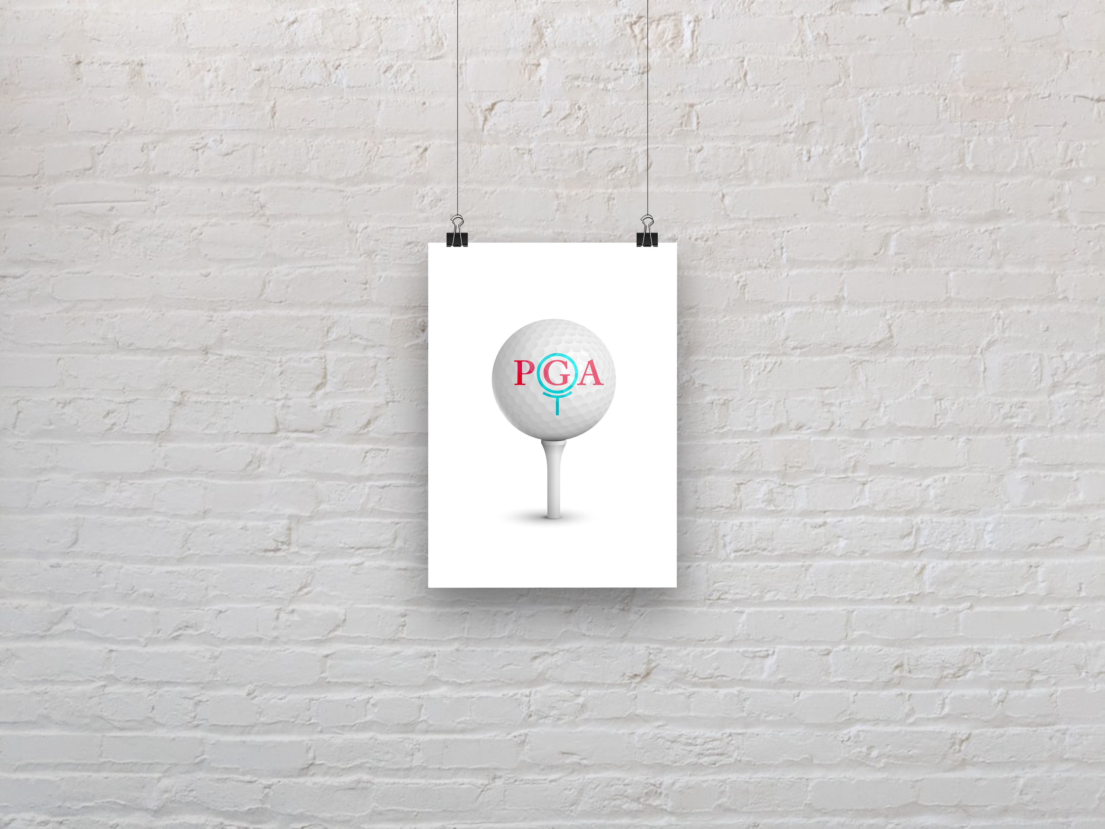
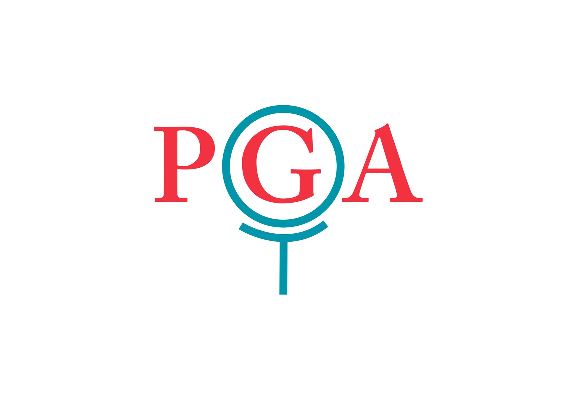
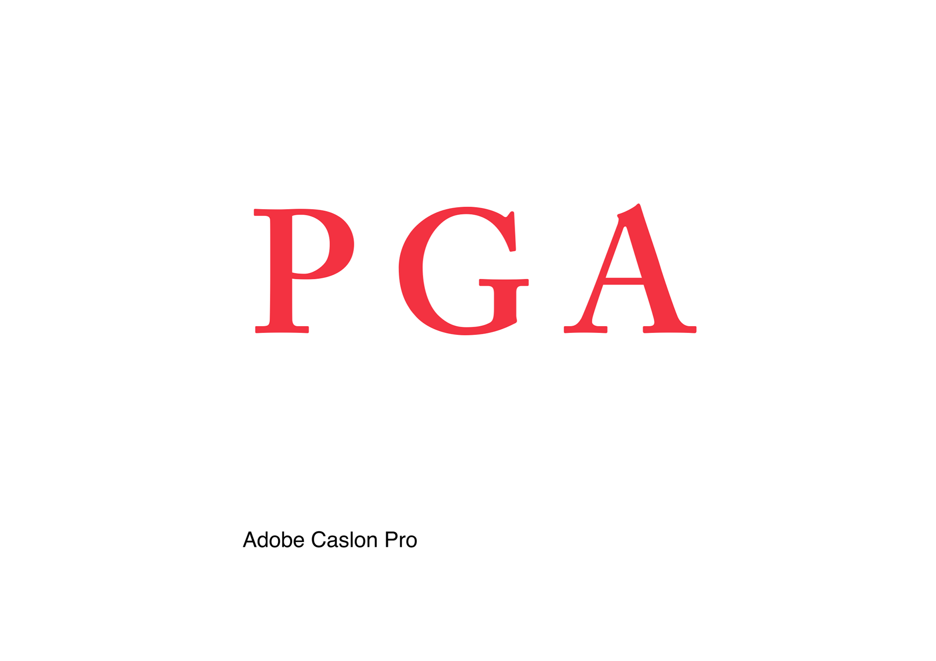
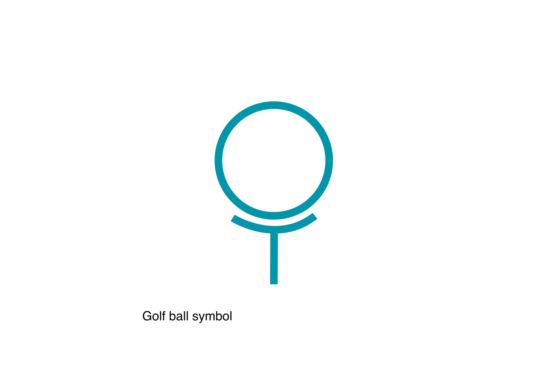
Solution:The new logo has a more modern approach and appeal. We have added new colors but still kept them classic theme of red, white, and blue. Although this is an American sport this is not why we added these colors. We added them because of the pyschology behind them. We have chosen to include a golf ball and tee symbol around the G, for golf.